Border Angels
Website Optimization
Border Angels is a distinguished nonprofit organization dedicated to advocating for human rights, humane immigration reform, and social justice. Our design process centers around creating a modern and simplistic website that not only preserves Border Angels' core mission statement and values but also aims to boost user engagement and involvement. By improving the overall user experience of current website, we strive to attract and inform new users about the nonprofit's crucial initiatives and impactful work in the community.


Role:
UX Designer / Researcher
Timeline:
3 Weeks
Tools:
Google Suite, Figma
00
Client Meeting
After engaging in iterative discussions with Border Angels, our team gained valuable insights into the nonprofit's website goals and specific requirements. This collaborative approach allowed us to align our design process effectively with their needs and aspirations.
Open Communication
Due to scheduling conflict, our team was unable to meet face-to-face on zoom with Border Angels Representatives. Instead, we had back and forth conversations via email to discuss their nonprofit. We asked them their opinion of their current design and what their main objectives were when it came to their target audience using their website.

Positives Aspects of Website
-
The stakeholders appreciate the website's effectiveness as an information and resource center.
-
They value the user-friendly approach to organizing services, breaking them down into clear categories.
-
The easy use of the donation page has received positive feedback from stakeholders.

Areas for Improvement
-
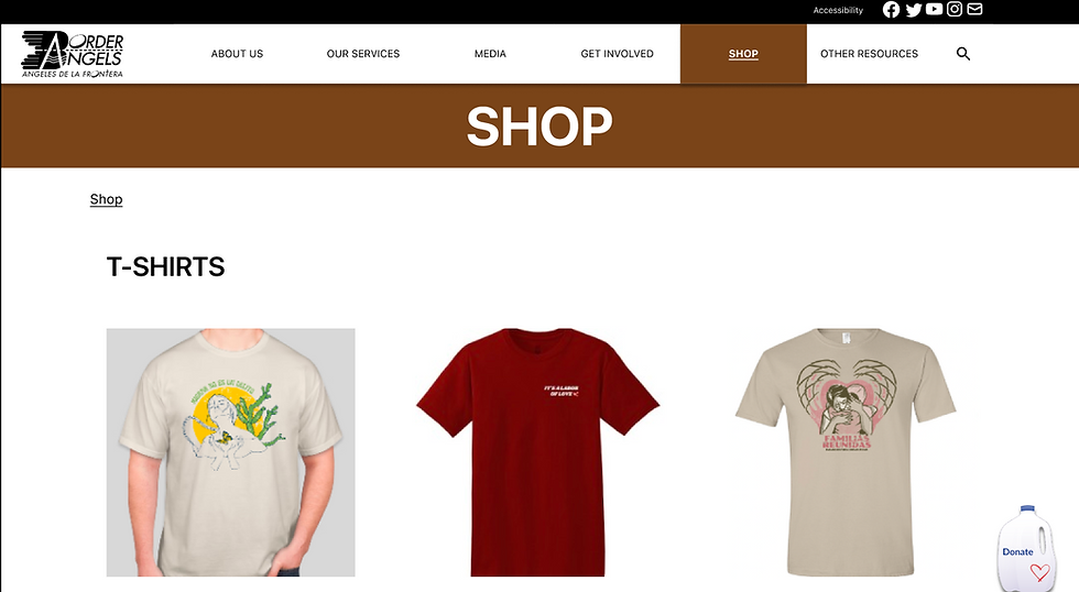
Stakeholders have identified the need for streamlined navigation on the shop page.
-
They have expressed the desire to enhance the volunteer information intake process for improved user experience.
-
Stakeholders are keen on ensuring ADA compliance across the website to cater to a wider audience and meet accessibility standards

01
Research Phase
Our team performed a thorough 'heuristic evaluation' of the existing website by mapping out a typical user path. In doing so, we put ourselves in the shoes of our user and experienced the website for it's intended purpose. Our goal was to reveal specific UI component issues. Leveraging these insights, we conducted user tests on the current site, enabling us to gain valuable feedback and further improve the user experience.
Typical User Path


Homepage
About Us Page
Water Drops Page


Community Outreach Page
News Page
Contact Us Page
How do users feel about the current about the current website?

“Search bar should be at the top with the navigation bar.”
"I like how the 'donate' button is consistent on each page."
"The fixed navigation bar helps me go through the site."
"Some of the pages and images feel too crowded."
"There amount of 'donate' buttons was overwhelming."
“Some of the navigation drop down buttons are not clickable.”
Key Takeaways from Initial User Interviews:
-
Main navigation bar functioned well, but users commented on the inconsistencies with the buttons and dropdown menus (‘contact us’ and ‘our services’) .
-
Users noted wanting to see better use of spacing on the webpage and placement of the photos.
-
Users spent a lot of time figuring out “Volunteer” page layout and where buttons were.
-
Users emphasized the need for a 'search' button in the main navigation bar.
02
Definition / Ideation Phase
As we transitioned into the definition & ideation phase of this website redesign, we began to break down the collected research in order to gain a clearer understanding of our target audience and their specific needs. Through our the creation of our affinity diagram and empathy map, we were able to truly understand the user we were designing for.
Navigation
Couldn't initially determine where search bar was located
Noticed there was no footer navigation
Dropdown elements need to be realigned
Would prefer sort of border to seperate info
Commented on alignment of Navigation Bar
Suggested the use of breadcumbs
Nav Bar items are overfilled, needs more organization
"Volunteer" section was not easy to locate
There could be a better organization of the pages
Content
Splash/Title Image on each page is nice and consistent
There are 2 pages where you can write your contact info (confusing)
Text/Photos in 'Our Work' section look out of place
Homepage has too much content
Redesign
Some photos can be replaced or located better
Volunteer Page needs to be reworked
About Us Page has different text alignment than other pages
Search Bar should be at the top of screen
Color scheme can be updated to something more modern
Homepage needs scroll indicator to show what is beyond the fold
The Affinity Diagram was the first step in analyzing the data that we collected in our Research Phase. We broke down the user interviews and notes and saw there were similarities in the comments we received. We then took all the comments and reorganized them into categories and trends that we saw were important in for this project. The categories we established were Navigation, Content, and Redesign.

The Birth of Jake Billabong:
The insights gathered from our affinity diagram and empathy map have led us to develop our User Persona, Jake Billabong. Jake serves as the embodiment of the ideal user for Border Angels. Utilizing his needs, pain points, and goals as a foundation, we have initiated the prototyping process for the upcoming version of the Border Angels website.

Jake Billabong
He/Him
Age: 32
About
Jake is a chemist who loves to hang out with his friends catching waves in San Diego. He enjoys finding new and creative ways to give back to the community. Current world events have motivated Jake to get more involved with various charitable organizations in order to gain a better understanding of the hardships others are facing and also to better recognize and appreciate his own privilege.
Goals
-
Wants to accomplish meaning in his life
-
Community involvement
-
Helping others
-
Pursues philanthropic ventures
Painpoints
-
Understands his unique privilege and is motivated to give back
-
Has a hard time finding long lasting organizations to work with
Habits:
-
Staying Active
-
Helping Others
03
Prototyping Phase
As we entered the prototyping phase, our goal was to enhance both stakeholder and user requirements. We prioritized these needs by creating a hierarchy, which then served as the foundation for our wireframe designs.
Navigation
Consistency
Breadcrumbs
ADA Compliance
Search Functions
White Space
Design Layouts
User Needs
Donate
Button
ADA Compliance
White Space
Design Layouts
Stakeholder Needs
Remapping the current navigation system:
In our wireframe development process, we proceeded by dissecting the existing Border Angels website to identify any redundant elements. We conducted a card sorting exercise to streamline the site's components, resulting in a more straightforward navigation system aimed at enhancing website performance. With this in mind, we were able to proceed with to the wireframes.
Utility
Home
Access.
Fund.
Contact
Donate
Socials
Main
About
Service
Media
Get Inv.
Shop
Other
Search
Team
(List)
News
Volunt.
Apparel
Asylum
Advoc.
Press
Intern
Access.
CBP
FAQ's
Foot.
Home
About
Map
Donate
Descrp.
Learn
Address
Phone
Low Fidelity Prototype:
Our lofi wireframe acted as a test to see whether or not our card sorting exercise had improved the site’s usability and performance through a navigation standpoint. We also made some other UI changes to the website including a new navigation bar, utility bar, and overall page organization redesign to help users gain a better understanding of the Border Angels mission.

Usability Test Notes:
-
Navigation Bar buttons needed more work. Some buttons on certain frames did not click properly
-
Search bar being moved to the main navigation was easy for users to locate
-
‘Volunteer’ and ‘donate’ pages were easy to find
-
Some frames had a lot of content, felt like ‘endless scrolling.
Mid Fidelity Prototype:
Following usability testing of our low-fidelity prototype, we received invaluable feedback concerning spacing, layout, and overall navigation issues. With these insights, we embarked on a series of iterative developments, effectively addressing the identified issues. Furthermore, we seamlessly integrated our UI Style Guide into the Midfi wireframe, ensuring that the chosen colors and styles harmoniously aligned with Border Angels' core mission and objectives. This cohesive approach enhanced the overall user experience and reinforced the organization's mission.

Usability Test Notes:
-
Users found that color changes of the navigation bar were a nice experience when moving around the main navigation
-
Adding some animation and videos would grab the attention of users when entering the homepage
-
Micro Interactions would also be a nice addition for further iterations
High Fidelity Prototype:
After conducting additional rounds of usability tests and presentations, we received more constructive feedback regarding the main navigation system. One thing that stood out was the response towards the functionality and aesthetic of our navigation dropdown. Our team reevaluated these design choices that were not yielding our desired results and made further adjustments to our design. These adjustments included reworking the use of color to ensure consistency within the navigation system, introducing more white space, rethinking the idea of the utility bar, and redesigning the navigation dropdowns. These changes were pivotal in shaping the final version of the website.

Usability Test Notes:
-
Users found the site more simple and easy to use
-
The design and global presence of the 'Donate Button' led to more engagement
-
The navigation dropdown menu did not feel as 'empty' as previous iterations
04
Conclusion
The central goal of this project was to enhance the overall user experience of the Border Angels' website by designing an interface that engages and informs new users about the nonprofit's essential initiatives in the community. We believe we achieved this by creating an inviting and user-friendly design, which not only attracts users but also facilitates easy navigation and exploration of the website's valuable content. We focused on problems regarding navigation, functionality, accessibility, and layout in order to achieve our goal.
Problem Focus - Navigation
We dedicated substantial effort to site mapping and enhancing navigational capabilities. The added color to the navigation acts as a "breadcrumb" tool as it is directly related the specific page color. The entire navigation bar has been made opaque to ensure accessibly and readability across all pages. In addition, we made every "Tab button" clickable and created their own landing page in order to ensure consistency. Overall, the redesign of the navigation bar, coupled with information condensation, greatly streamlined the user experience, making it significantly easier to browse the site and locate specific information with precision.

Original Navigation Bar

Lofi Navigation Bar

Hifi Navigation Bar
Original Navigation Bar


Reflection:
Our collaboration with Border Angels offered invaluable insights into navigating the delicate balance between stakeholder demands and prioritizing user needs. It underscored the critical importance of effective communication and proactive problem-solving in aligning with both stakeholder expectations and user-centric goals. Ultimately, this experience has not only enriched our understanding of partnership dynamics but also reinforced our commitment to driving meaningful outcomes in serving our community.